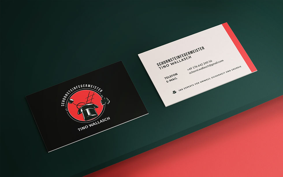
Soot, Craft &
Electric Red.
The chimney sweep is one of the oldest trades in Europe – a craft so steeped in symbolism that its iconography practically writes itself. When a dear friend's brother came to me in 2020 to build his brand from the ground up, the brief was clear: honor the tradition without being trapped by it. The result was his first full Corporate Design – and my first freelance branding project.
Services
Brand Strategy
Logo Design
Corporate Design
Visual Identity System
Colour Concept
Year
2020
Location
Berlin & Brandenburg

THE WAY OF THE
SCHORNI, ROOTED IN CODEX.
What Set Us Apart
The chimney sweep carries centuries of visual language – the top hat, the hearth brush, the lucky charm. Rather than modernize it away,
the logo leans into that iconography deliberately: timeless by design – structured, confident, and immediately readable as belonging to a craft with deep roots with a playful twist. Literally.


Derivation
Because a tradesperson's brand lives on business cards, van signage, and uniforms – it has to hold everywhere, at any size.


DESIGNED PRINCIPLES
Where the form bows to tradition, the colour breaks from it. Electric red – not the safe, dusty palette you'd expect from the trade – arrived as the brand's statement of intent. It says: this is a craftsman who takes his work seriously and his brand even more so. The red doesn't fight the classic silhouette; it charges it. The two exist in tension, and that tension is the brand.
The client came with clear instincts: the traditional top hat, and the Brandenburg eagle as an early point of inspiration. Two creative sessions, a range of styles explored, and one mark that felt inevitable – the iterations below show how we got there.